Board #12 – Magnolia beauty

I had a special request this week from a former classmate and friend of mine to put together a board inspired by magnolias with the colors being green, gold and white. I find this color palette especially near and dear because it hearkens back to my southern roots. I grew up climbing magnolia trees with all of my cousins in my great uncle’s front yard and that is a fond memory of my childhood. I think to pay the proper respect to this great southern bloom, one must have a grand southern affair complete with a historic venue (perhaps a plantation home or old courthouse?), classic tuxedos, and beautiful ecru engraved invitations. I even love the idea of the calligraphy being in a beautiful, deep emerald tone. This is absolutely one of my favorite palettes I’ve created and I commend the bride for devising such a unique and heritage-driven theme for her wedding.

Board #11 - Magnolia love

Clockwise from top left: 1 / 2 / 3 / 4 / 5 / 6 / 7


Board #11 – Shades of purple and grey

A friend of mine (from why back in elementary school!) requested a board with black, white, grey, and shades of purple. This is a pretty formal and muted palette, so I kicked it up a notch by throwing in a striped motif. Stripes are great because you can incorporate them throughout the wedding, from linens, to attire, to invites, to the cake! Enjoy!

Board #12 - shades of purple and grey

Clockwise from top left: 1 / 2 / 3 / 4 / 5 / 6 / 7

Board #10 – Neutral Beauty

For this board, I decided to tone it down a notch from my typical style and lean towards a more neutral palette. If neutral is done right, it can be really beautiful. I always love to add at least one pop of color – in this case, a pale coral-pink. My personal favorite pic is the groomsmen shot – Leslee Mitchell does beautiful work and 2 of my good friends were groomsmen in this wedding.Inspiration Board #10 Neutral beautyclockwise from top left: 1 / 2 / 3 / 4 / 5 / 6 /


Board #9 – Modern Tangerine and White

When I got married I already knew what my wedding colors were going to be, but I contemplated one other color combo for a hot minute. I love orange/grey/white as a combo, because it’s unique and contemporary. But orange is a much harder color to come by than yellow, which is I why I opted for yellow instead. In hindsight, I wish I had used these colors because I see yellow and grey EVERYWHERE now. OH well! Hope you enjoy!

Inspiration Board #9 - Tangerine dream

Clockwise from top left:                                                                                                                                            1 / 2 / 3 / 4 / 5 / 6 /

Board #8 – Turquoise, Coral, and Gold

I have a serious crush on this festive and fun color combo. It has the feminine coral touches without being over-the-top girly and is also glamorous with the touches of gold. I usually don’t LOVE pink in a wedding, unless it’s brightly hued and combined with some fun non-pink colors. I pulled some of my favorite images from a shared Pinterest board for this board. Hope you enjoy!

Inspiration Board #8- Turquoise, Pink, and Gold (1)

The numbers will link you to the original, gorgeous weddings these images are pulled from! Clockwise from top left 1. These Bari Jay bridesmaids dresses are a personal favorite! / 2. How sweet and simple is this cake? Perfect for an outdoor bride / 3. I have serious love affair with succulents / 4. Mason jars with striped straws are a perfect way to serve a signature cocktail! / 5. Those envelope liners and fun quirky calligraphy drive me wild! So fun! / 6. Turquoise bow ties are the bees’ knees. / 7. Kate spade. Need I say more?

Inspiration Board #6 – Yellow, Green, Grey, and Chevron

So…I’m so obsessed with my own wedding, that I decided to make an inspiration board with 100% of the images pulled from our day. Special thanks to Stephen DeVries for the amazing photos.

1. Koozies – Corey designed the koozies, and Personalized Drinkware printed his custom design on their neoprene koozies. We loved them!

2. Save the Dates – Corey and I designed the save the dates, they are printed on paper from Paces Papers, and we got them printed and cut out at Sam Flax. We loved the fun quirkiness of postcards! Read more about our paper products here.

3. Initials – My mother sewed the ‘placemat’ under the letters, assembled the letters on the base, and Corey spray painted them. The letters are plain cardboard from a local craft store. This was a $5 project.

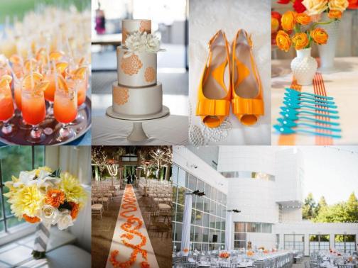
4. Shoes – Kate Spade’s ‘Crown’ – you can read ALL about them on this post.

5. Straws – We already had the straw holders and mom printed paper labels to cover the Coke labels on them. The striped straws are from Kikkerland.

6. Cake – I loved loved loved my wedding cake. I designed it and Hilde from Magnificent Cakes brought the design to life. It was delicious too! The bunting cake topper was from an Etsy store called domesticcharm. Katelyn, who owns the store was so great to work with!

7. Bridal Clutch – I ordered this custom clutch from Waterpath Designs on Etsy. I loved how I was able to customize the fabric and they even sewed a grey lining on the inside for me! It was only $30!

8. We collected glass bottles from EVERYWHERE. Ikea, Hobby Lobby, Michael’s, antique stores, relatives’ attics, you name it! All in all, there was about 150 bottles! The great thing about the bottles was that they were high impact, so we didn’t have to have lots of flowers to make an impression.

9. Bridal Bouquet – I asked the florist for dusty miller (how appropriate), coral colors, succulents, billy balls, and something white and fluffy. This is what they came up with and I ABSOLUTELY loved it. The florists were Rachel Gaudel and Andy Boyles. I told the florist to wrap a swatch of the leftover chevron fabric around the base. It turned out adorable!

10. Bridesmaids’ bouquet – I love it just as much as mine. The white tulips were such an elegant addition!

11. Boutonniere – The florist wrapped the fabric around his bout and used succulent, dusty miller, and billy ball.

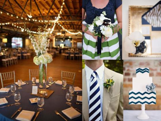
12. Bridesmaids dresses – I let the girls all pick out their own Lula Kate style and choose from three colors I thought looked pretty together. The dresses are all from Bella Bridesmaid in Birmingham. I thought they looked gorgeous and the Silk Shantung fabric coordinated beautifully with my gown.

From inspiration to reality – The paper products

Designing invites, programs, save the dates, signage, and RSVP’s was one of the MOST daunting tasks we underwent during the wedding process, but it was so worth it. If you design it yourself, it really has YOU in it and you know that you will be 100% happy with it. I definitely don’t recommend it if you don’t have Adobe Creative Suite to help you out though! My biggest advice with DIY invites, is don’t procrastinate (like we did) because it makes life so stressful. Also, ask for a fresh set of eyes ALWAYS to help you proofread. The last thing you EVER EVER EVER want is a misspelling or error on something that you could have prevented! And be aware that you will need to print things constantly to check it all, so have one handy! Now for the fun part!

Invite inspiration

Loved the shape of this so much! Click the image to see the original post!

I really liked the narrow chevron and the paper texture. I also loved the location of the chevron at the top.

Corey designed the adorable logo on the RSVP. The Aerialist Press letterpressed the invites and address on the envelope on gorgeous Crane textured paper. Corey and I designed and laid out all of it. We loved coordinating the stamps to the invite colors and we tied yellow baker’s twine around the suite.


Save the date inspiration

We really liked the postcard idea and the layout on the back. We also loved the metallic paper. Click image to go to the etsy listing!

We loved the white blocked out squares on the bold yellow background. We incorporated that onto the front of our save the date. Click the image to go to the designer’s site.

Finished result of our save the dates. We designed them (Corey drew the adorable logo) and had them printed at a local art store called Sam Flax. We ordered linen finish 80# metallic paper from Paces Papers in Buckhead. We were so pleased with how they turned out at the end! Notice the coordinating stamps 😉


Program inspiration

We liked the shape, again, and the logo on the front of the bifold program.

Loved the chevron background of this and the script combined with the block font. Please do yourself a favor and click the image, the wedding is GORGEOUS.

The beautiful wedding programs. I was so thrilled with how these turned out. Corey had a heavy hand in designing these – he came up with the logo on the front and drew the map on the back. He also came up with the idea of using light grey chevron in the background instead of yellow. I used the same font that was on the invite and RSVP for the script front. My mom printed these and folded them for us too!

Everything together! I can’t forget the Rehearsal Dinner invites, which were designed and printed by Darby Cards in Nashville. She was GREAT to work with and we loved them!

So there you have it! I would love to hear what you like best!


Inspiration Board #5 – Navy, Purple, and Lace


Inspiration Board #5 – Navy, Purple, and Lace

I made this for a very good friend of mine – you know who you are!! When she told me the color palette, I instantly pictured a lush garden reception with classic and formal details, but a little on the non-traditional side. I envisioned a groom in a dark suit with a bright fun tie and bridesmaids in fun dresses. These anthropologie gowns fit the bill! I love the subtle inclusion of lace in the cake and the bridesmaids adorable gowns. The Anna Maier Ulla-Maija gown is to DIE for. I also love Sperry tents for a garden reception in the spring. Tell me what you think below!

1. Cake – classic and elegant

2. Groom’s outfit – fun and formal, but not stuffy!

3. Lace gown – do yourself a favor and check out this amazing wedding. The venue in Charleston is to die for!

4. Sperry tent – totally gorgeous. So worth the expense ( they are VERY pricey! )

5. Bouquet – the wedding this bouquet came from has STUNNING flowers.

6. Bridesmaids – adorable. ‘Nuf said.

7. Invite – I couldn’t find where these came from but I LOVE the classic filigree but the modern layout.


Inspiration Board #4 – Nautical navy, coral, white, and light lime

I made this board for a sweet friend of mine that lets me indulge her day in and day out with wedding mumbo jumbo. I asked her if she were to get married, what her dream color palette would be. She asked for a nautical feel with navy, coral, white, and seafoam (which I went with more light lime in this board). The result is below! I encourage you to click the links as well – the weddings featured are all stunning.

Clockwise from top left:

1. Boutonniere  – a small pop of coral

2. Adorable ring bearer – I just LOVE his outfit!

3. Paper suite – preppy navy and coral designed by Posh Paperie

4. Reception space – I just love how glam this is!

5. Bouquet – don’t you just LOVE that striped bouquet wrap? So nautical!

6. Wedding cake – this is so whimsical and I love the stripes and the rope!

7. Sailboat

8. Amsale Dahlia gown – The wedding I pulled this image from is a stunner. This is also one of my friend’s favorite wedding gowns ever.

9. Bridesmaid’s outfits – probably my fave of all time. The skirt is from Anne M Cramer.

Hope y’all love it! I think this would be a stunning wedding if I must say so myself.